The zip contains: template_title.png, template_section.png, template_kpi.png, template_content.png, template_closing.png
Extract the zip into lab3-finance-presentation/template/ so the images are at lab3-finance-presentation/template/template_title.png, etc.
1c. In the Kiro chat panel, start a New Session in Vibe mode and paste:
PROMPT — Copy & paste into Kiro
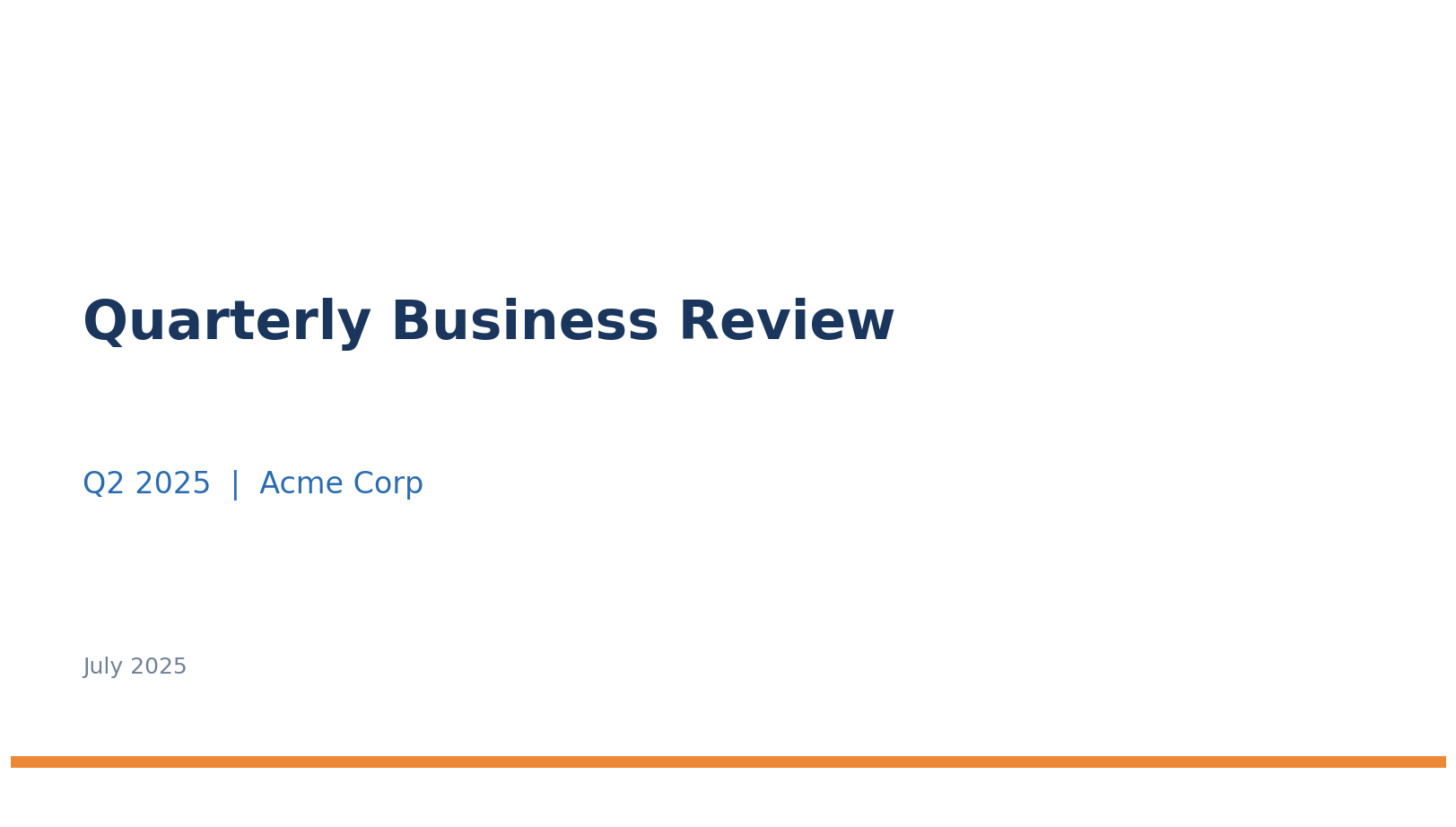
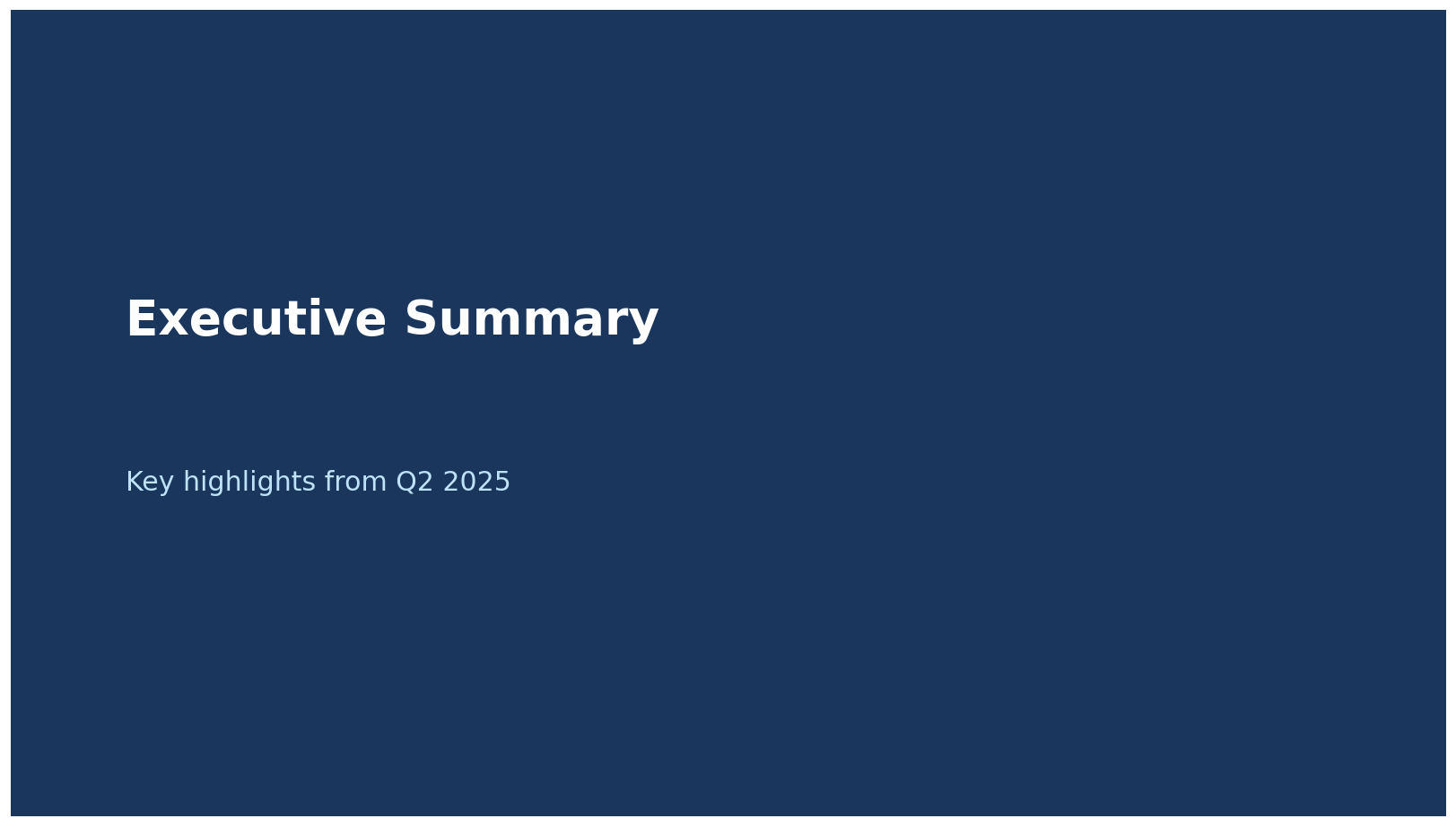
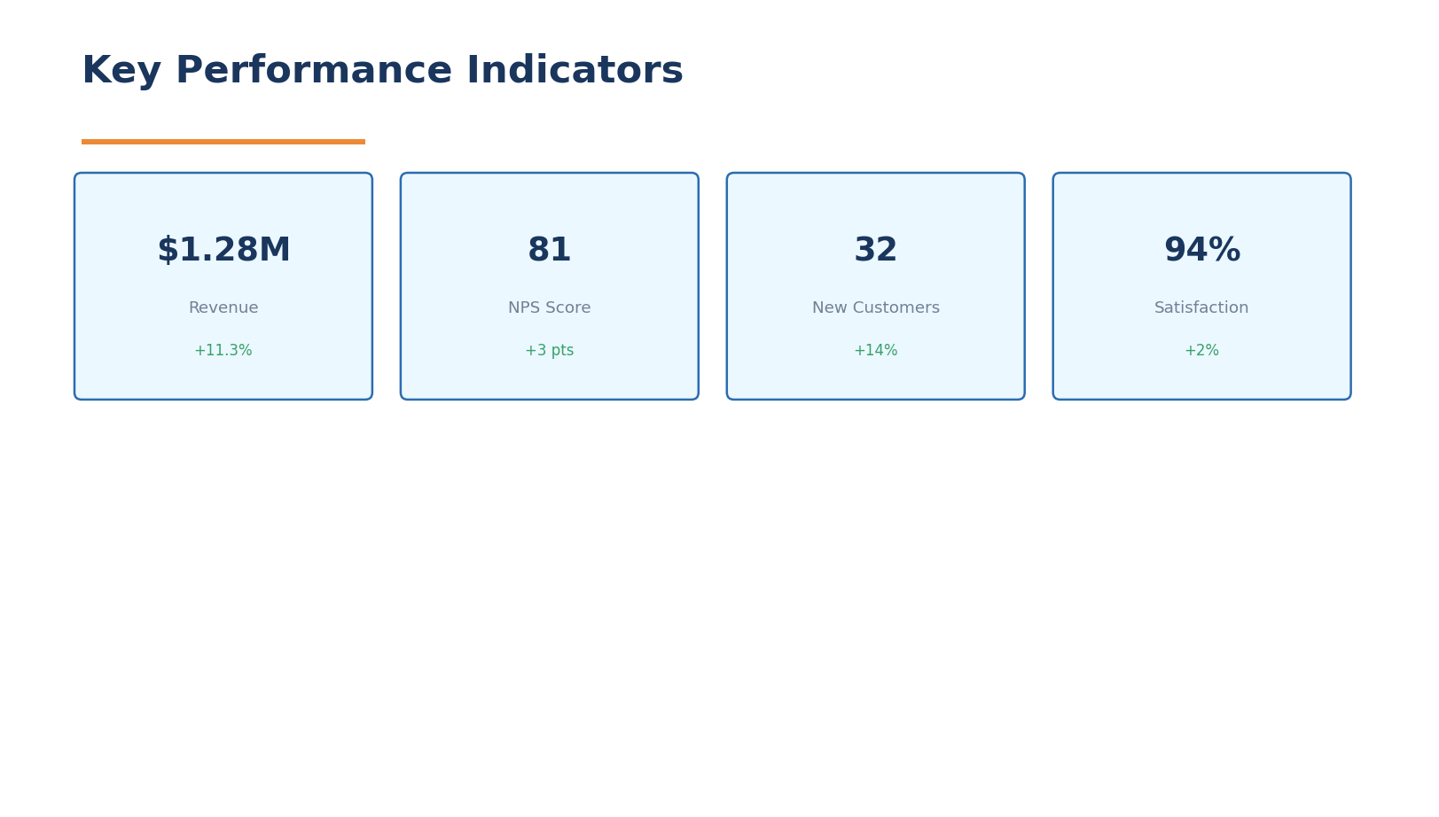
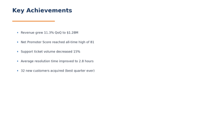
I have 5 template slide screenshots in the lab3-finance-presentation/template folder (template_title.png, template_section.png, template_kpi.png, template_content.png, template_closing.png).
Please:
1. Look at each template screenshot and extract the visual style: colors, fonts, layout, spacing, and design patterns
2. Create a file called monthly_kpis.csv in the lab3-finance-presentation folder with 6 months of AnyCompany Finance KPI data (Jan 2025 - Jun 2025):
Columns: month, total_revenue_sgd, transaction_volume, active_merchants, wallet_txns, credit_card_txns, bnpl_txns, fraud_rate_pct, avg_settlement_hours, customer_satisfaction_score, new_merchant_signups, chargeback_rate_pct
Make the data show a growth trend:
- Revenue growing from $12M to $18M SGD
- Transaction volume growing from 2.1M to 3.2M
- Fraud rate decreasing from 0.8% to 0.4%
- Customer satisfaction improving from 4.1 to 4.6
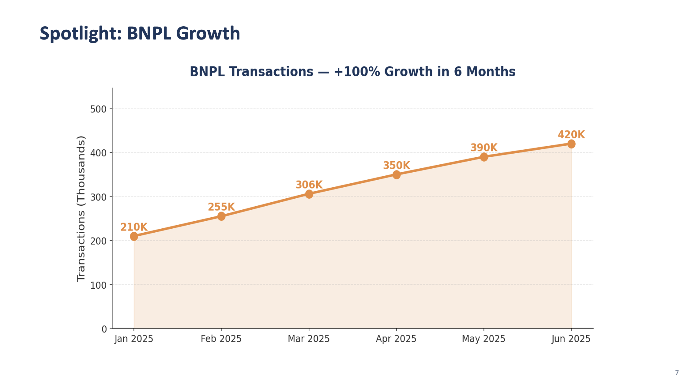
- BNPL transactions growing fastest (40% growth over 6 months)
3. Create a file called regional_breakdown.csv with columns: region, revenue_sgd, transaction_count, active_merchants, growth_rate_pct
For: Singapore, Malaysia, Indonesia, Thailand, Vietnam, Philippines
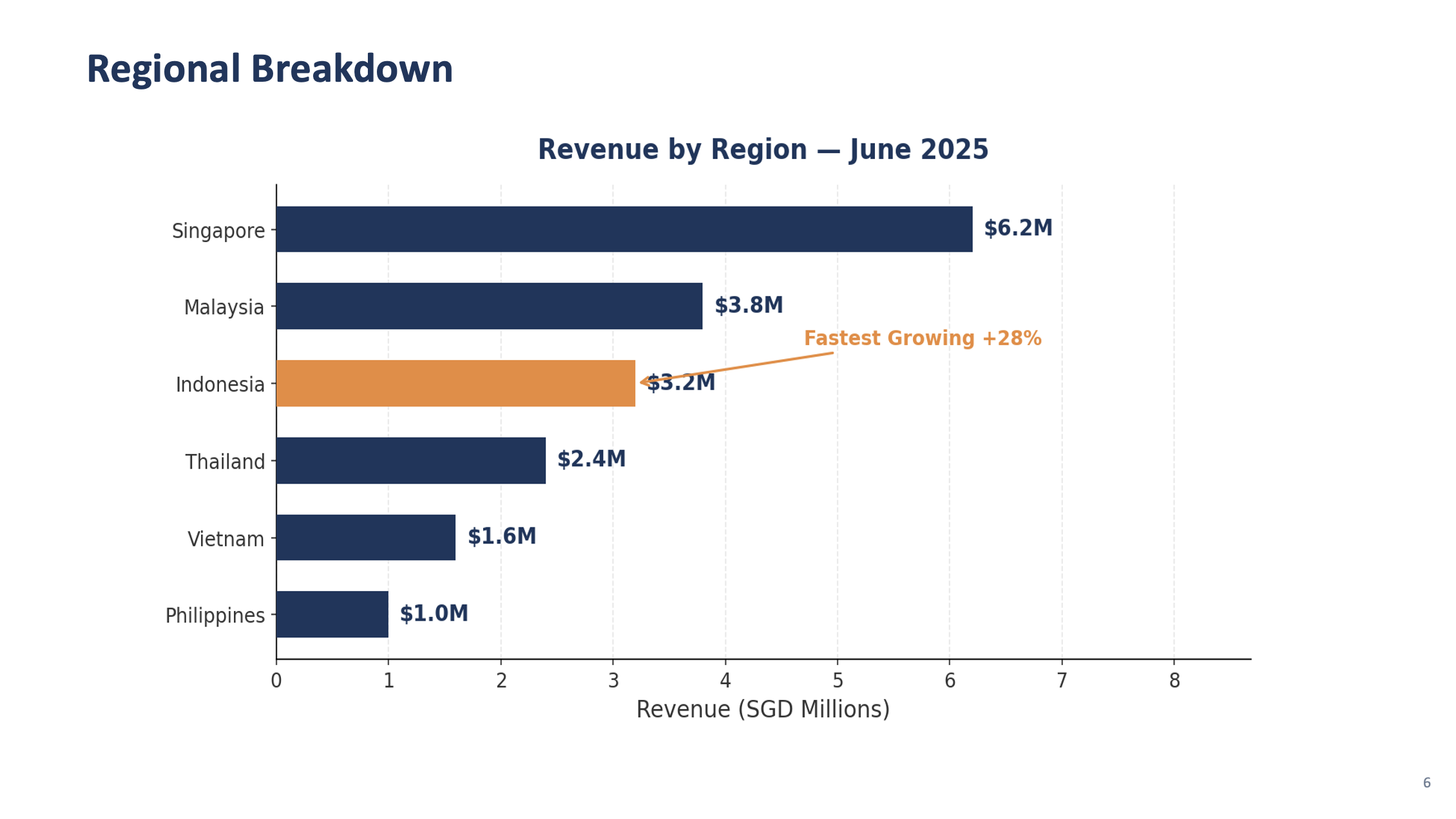
Singapore should be the largest market, Indonesia the fastest growing.
4. Give me a summary of:
- The brand style you identified (colors, fonts, layout patterns)
- The slide types available based on the templates
- Key trends in the KPI data
✅ Checkpoint: Brand style extracted from screenshots · monthly_kpis.csv with 6 months of data · regional_breakdown.csv with 6 markets · Kiro's style and trend analysis
Step 2: Analyze Style & Build the Generator Script
🧩 What's happening in this step
You're asking Kiro to write a Python script that automatically builds PowerPoint slides from your data. Think of it like creating a macro — but instead of recording clicks, you describe what you want in plain English and Kiro writes the code for you.
The prompt mentions a few tools that Kiro will install and use behind the scenes:
python-pptx — creates PowerPoint files (.pptx) programmatically, like a robot that builds slides for you
pandas — reads and processes your CSV data (the KPI and regional files from Step 1)
matplotlib — draws charts (bar charts, line charts) that get embedded into the slides
You don't need to understand the code — just run it and review the output. The power here is that once the script works, you can reuse it every month with new data.
In the same chat session, paste:
PROMPT — Copy & paste into Kiro
You are the CFO's Executive Assistant preparing the Monthly Finance Review for the leadership team. You know what executives care about: clear KPIs, trend direction, and actionable insights. The presentation must be polished and on-brand.
Based on the style you extracted from the 5 template screenshots, create:
1. A template_config.json file in the lab3-finance-presentation folder that defines the brand settings you identified:
- Colors (background, accent, text, headings) extracted from the templates
- Font choices that match the template style
- Slide layouts for each template type: title, section_divider, kpi_dashboard, content, closing
- Company name: "AnyCompany Financial Group"
- Presentation title: "Monthly Finance Review — June 2025"
2. A Python script called generate_review.py in the lab3-finance-presentation folder that:
- Reads template_config.json for brand settings
- Reads monthly_kpis.csv and regional_breakdown.csv using pandas
- Creates a 16:9 widescreen PowerPoint using python-pptx
- Creates a title slide matching the template_title.png style
- Creates a section divider slide matching the template_section.png style
- Saves as "review_test.pptx" with just the title and one section slide
Install python-pptx, pandas, matplotlib automatically. Run the script.
Open review_test.pptx and verify the slides match the template screenshots.
🖥️ How to view the PPTX on the remote lab
Option A — Open in LibreOffice (if installed during lab setup):
Double-click the .pptx file in the file manager — it will open in LibreOffice Impress.
Option B — Ask Kiro to export as images:
If LibreOffice isn't installed, paste this into Kiro chat:
PROMPT — View slides as images
Convert review_test.pptx to PNG images so I can preview the slides. Save each slide as slide_1.png, slide_2.png, etc. in the lab3-finance-presentation folder. Use libreoffice in headless mode to convert.
Then open the PNG files in the file manager — double-click to preview.
✅ Checkpoint: template_config.json generated from screenshot analysis · generate_review.py created · Test presentation matches template style (view as PNG or in LibreOffice)
💡 Iterating on the design
PowerPoint generation with python-pptx can sometimes produce layouts that aren't pixel-perfect on the first try — text might overlap, fonts may look slightly different, or spacing could be off. This is normal and actually a great learning moment:
Open the generated PPTX and look at what needs adjusting
Describe the issue to Kiro in plain English: "The title text is too small", "Move the chart to the right", "The KPI cards are overlapping — add more spacing"
Kiro will update the code and regenerate — this back-and-forth is how real development works
Each iteration gets closer to the template. 2-3 rounds of feedback usually gets it right.
This iterative approach is one of the most powerful aspects of working with AI — you don't need to get the prompt perfect the first time.
Step 3: Generate the Full Presentation
In the same chat session, paste each prompt sequentially. Kiro will create slides that match the template style it extracted:
KPI Dashboard Slide
PROMPT 3a — KPI Dashboard
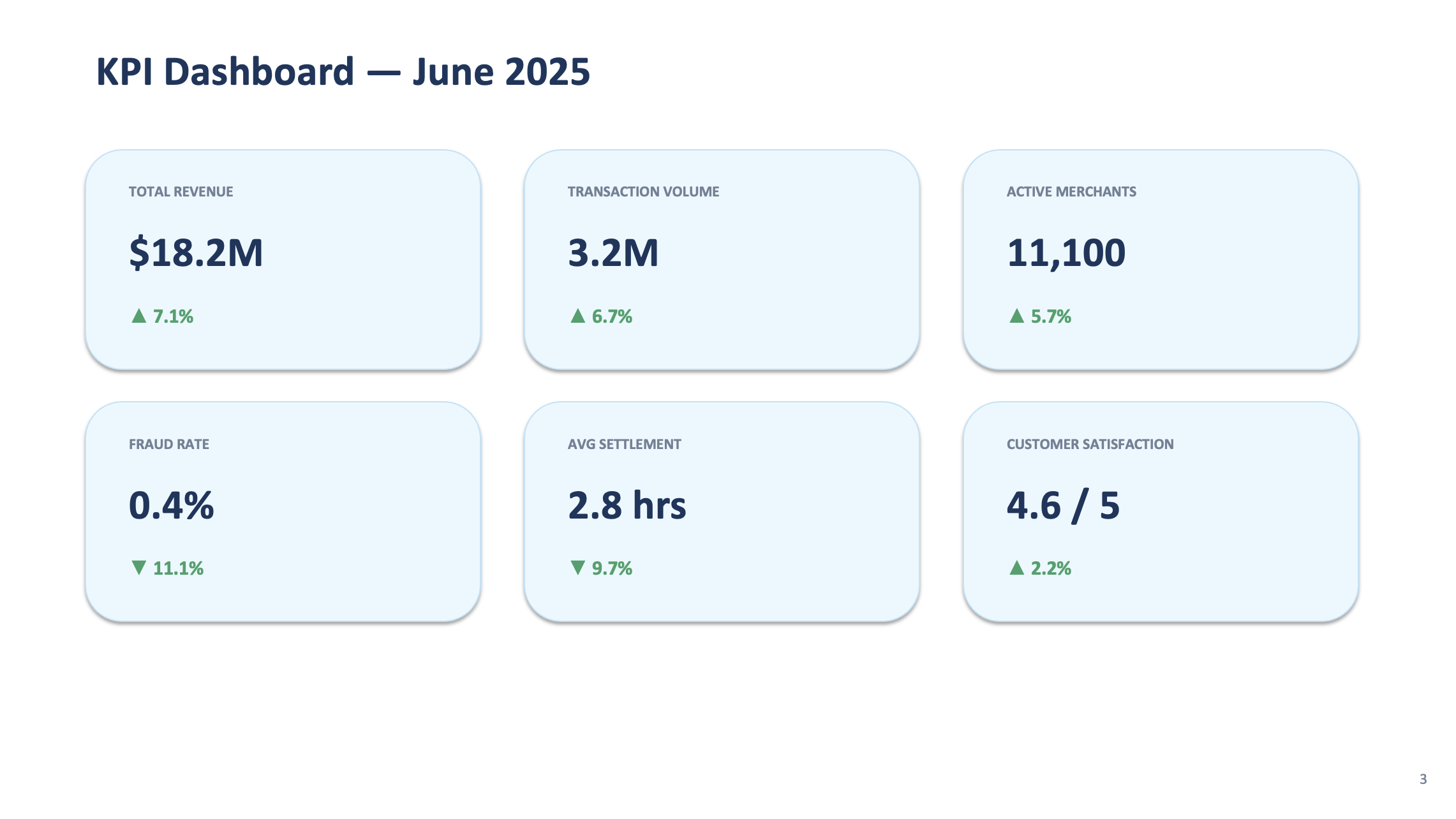
Add a function create_kpi_dashboard(df) that creates a KPI dashboard slide matching the template_kpi.png style. Show the latest month's metrics in a grid of 6 cards:
- Total Revenue: $18.2M SGD (with month-over-month change %)
- Transaction Volume: 3.2M (with change %)
- Active Merchants: count with change %
- Fraud Rate: 0.4% (green, showing improvement)
- Avg Settlement: hours with change
- Customer Satisfaction: score out of 5
Each card should have the metric name, value, and a green up-arrow or red down-arrow for the trend. Use the brand colors from template_config.json.
Chart Slides
PROMPT 3b — Charts
Add two chart functions that create content slides matching the template_content.png style:
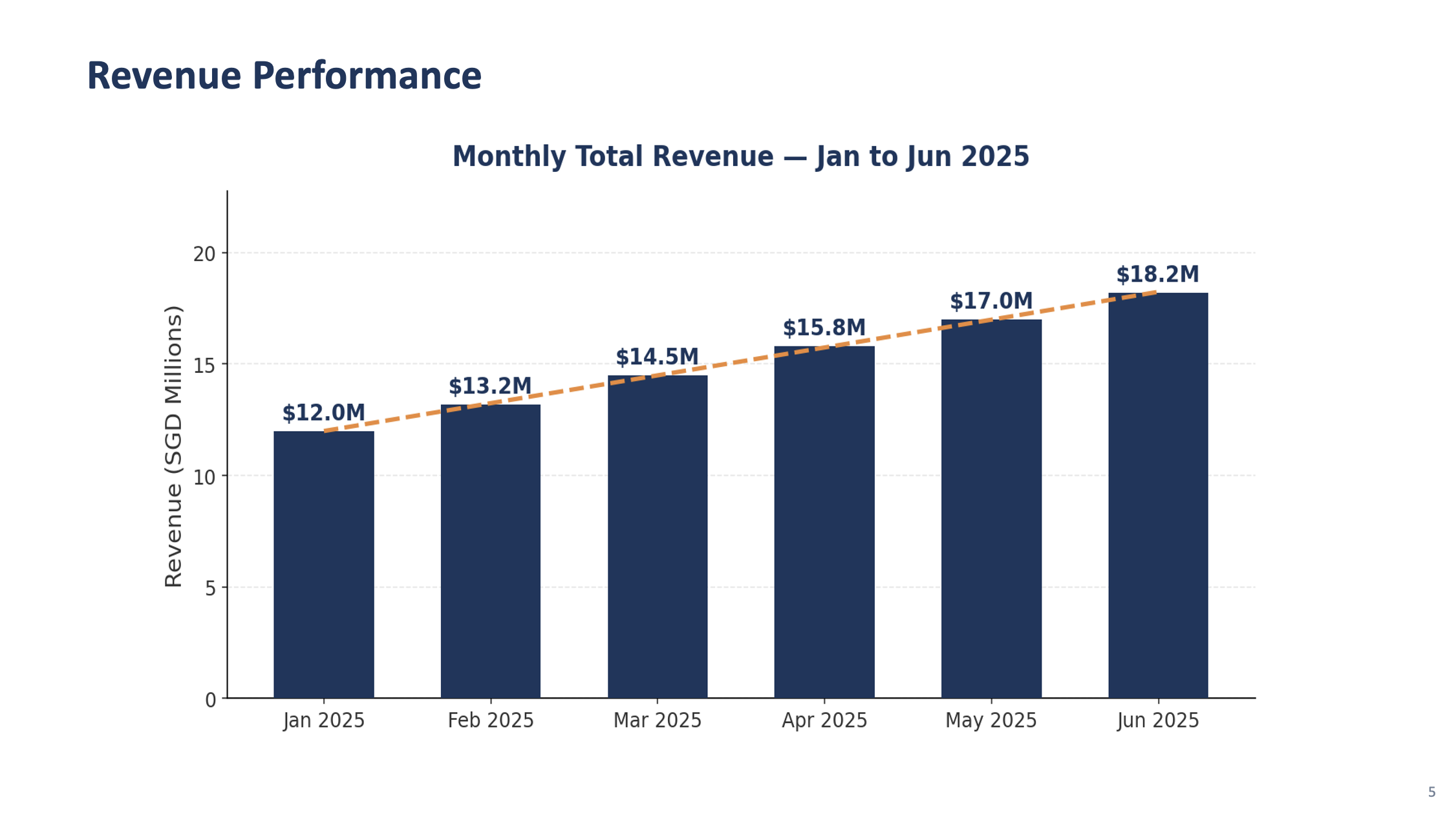
1. create_revenue_chart(df) — Bar chart of Total Revenue by month using matplotlib. Use the brand colors from the template. Show growth trend line overlay.
2. create_regional_chart(df) — Horizontal bar chart showing revenue by region, sorted largest to smallest. Highlight Indonesia with a different shade and annotate "Fastest Growing +28%"
Save charts as temporary PNGs and embed them in the slides.
Analysis and Outlook Slides
PROMPT 3c — Analysis & Outlook
Add three more functions using the template styles:
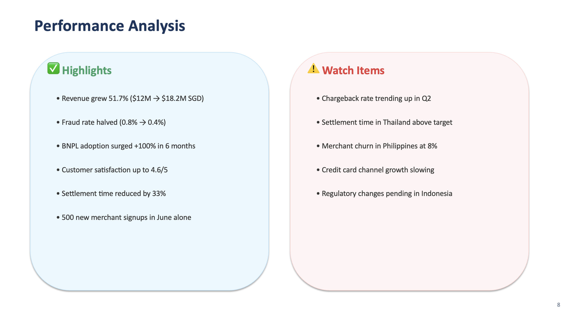
1. create_performance_analysis(df) — Two-column content slide: "Highlights" on the left (revenue growth, fraud reduction, BNPL adoption) and "Watch Items" on the right (chargeback rate trend, settlement time in Thailand, merchant churn in Philippines)
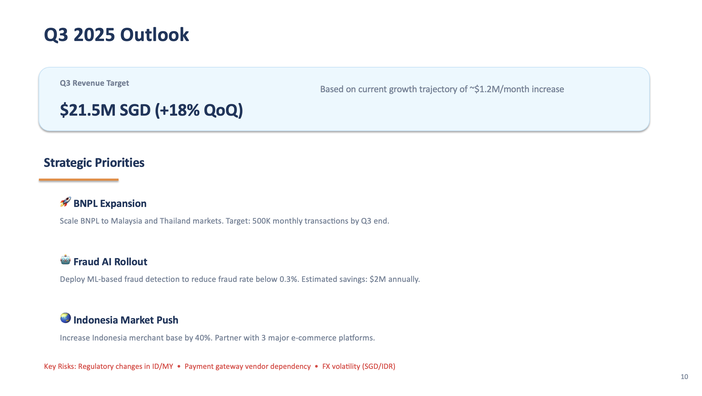
2. create_outlook_slide(df) — "Q3 2025 Outlook" slide with revenue target extrapolated from trend, 3 strategic priorities (BNPL expansion, fraud AI rollout, Indonesia market push), and key risks
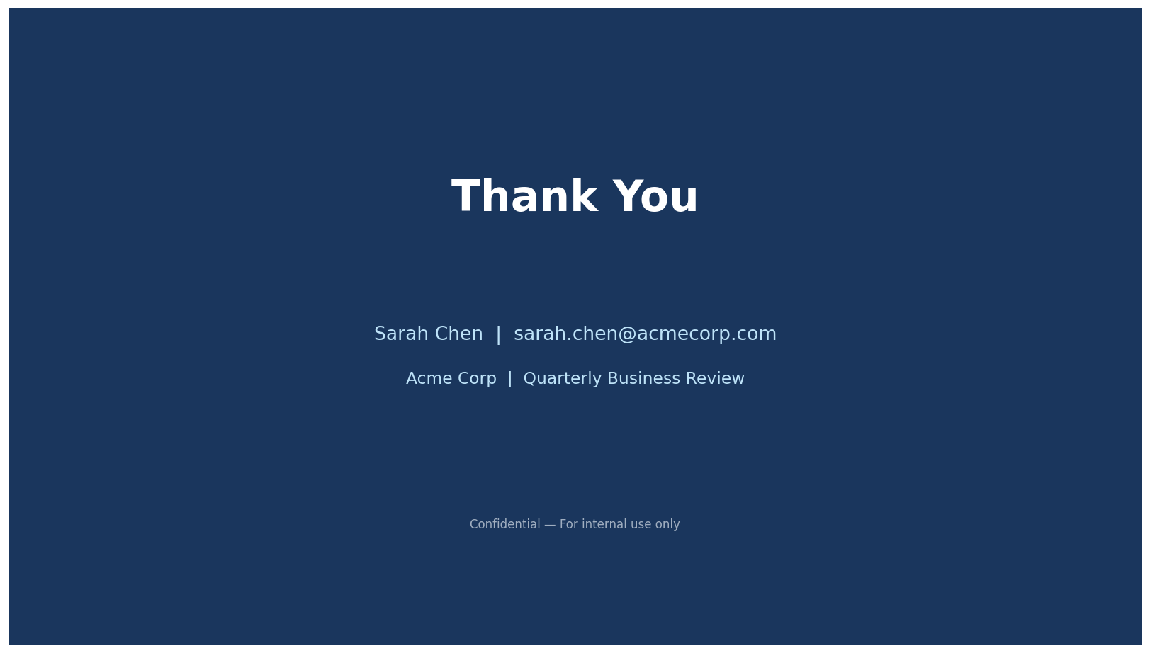
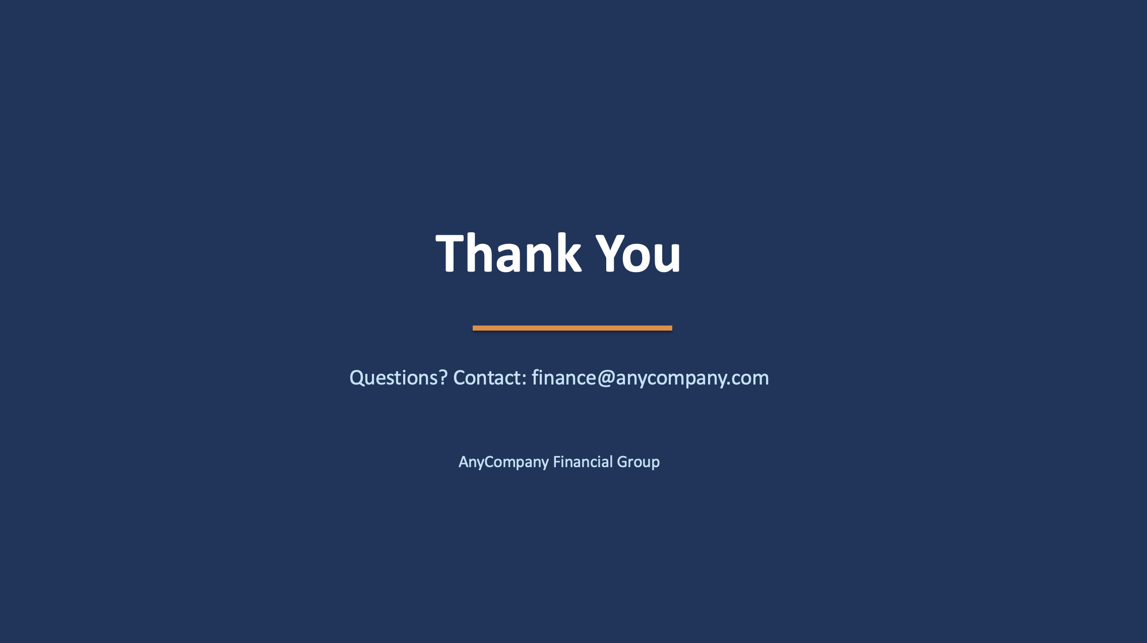
3. create_closing_slide() — Closing slide matching template_closing.png style, "Thank You" in large text, "Questions? Contact: finance@anycompany.com" below
Assemble the Full Presentation
PROMPT 3d — Assemble
Update the main block to assemble the complete presentation in this order:
1. Title slide
2. Section divider: "Executive Summary"
3. KPI Dashboard
4. Section divider: "Financial Performance"
5. Revenue chart
6. Regional breakdown chart
7. Performance analysis (two-column)
8. Section divider: "Strategic Outlook"
9. Outlook slide
10. Closing slide
Add slide numbers to the bottom-right of each content slide (except title and closing).
Save as "AnyCompany_Finance_Monthly_Review_June_2025.pptx". Run the script.
Step 4: Review & Iterate
Open the generated PPTX and review all 10 slides. If anything needs adjusting, just describe it to Kiro. Here are some common refinements:
EXAMPLE ITERATION PROMPTS — use whichever apply
Review the generated presentation and fix these issues:
- Make the chart fonts larger and more readable
- Add a subtle grid on the y-axis of the charts
- Ensure all text fits within slide boundaries (no overflow or clipping)
- The KPI cards need more spacing between them
- Add a "BNPL Growth" spotlight slide between the regional chart and performance analysis showing BNPL transaction growth as a line chart with month labels
Regenerate the presentation.
🎯 Pro tip: Screenshot and describe
If a slide doesn't look right, you can take a screenshot of the problematic slide and drag it into the Kiro chat. Then say: "This slide has overlapping text — fix the layout." Kiro can see the image and understand exactly what needs to change. This is often faster than describing the issue in words.
Preview: Final Presentation (11 Slides)
Here's what the finished presentation looks like after all steps. Use the arrows to browse through all 11 slides:
Slide 1 of 11 — Title
What You Accomplished
📸 Extracted brand style from template screenshots using Kiro's vision
📊 Generated data-driven charts with matplotlib
🏗️ Built a complete 10+ slide PPTX that matches your corporate template
🔄 Iterated on the design through natural language
The same script can be reused with new data each month — just update the CSV files and re-run. The template style stays consistent automatically.